` | Conteneur générique (quand rien d'autre ne convient) |
---
## Partie E : Mise en page avec Flexbox
### E.1 Introduction à Flexbox
Flexbox est une méthode moderne pour créer des mises en page flexibles.
```css
.conteneur {
display: flex;
}
```
### E.2 Propriétés du conteneur flex
```css
.conteneur {
display: flex;
flex-direction: row; /* row, column, row-reverse, column-reverse */
justify-content: center; /* Alignement horizontal */
align-items: center; /* Alignement vertical */
flex-wrap: wrap; /* Retour à la ligne si nécessaire */
gap: 20px; /* Espacement entre les éléments */
}
```
**justify-content** (axe principal) :
- `flex-start` : début
- `flex-end` : fin
- `center` : centré
- `space-between` : espace entre les éléments
- `space-around` : espace autour des éléments
**align-items** (axe secondaire) :
- `flex-start`, `flex-end`, `center`, `stretch`
### E.3 Propriétés des éléments flex
```css
.element {
flex: 1; /* Prend l'espace disponible */
flex-basis: 200px; /* Taille de base */
order: 2; /* Ordre d'affichage */
}
```
### E.4 Exercice interactif : Flexbox Froggy
Maîtrisez Flexbox avec **Flexbox Froggy** :
👉 **[flexboxfroggy.com](https://flexboxfroggy.com)** (24 niveaux)
Objectif : terminer tous les niveaux !
---
## Partie F : Projet - Site "Pastor"
Vous allez créer un site de blog culinaire avec une mise en page complète.
### F.1 Préparation
Créez l'arborescence suivante :
```
TP_CSS/
├── pages/
│ └── index.html
├── images/
│ └── (télécharger la banque d'images fournie)
└── styles/
└── style.css
```
### F.2 Structure HTML
Voici la structure visuelle du site Pastor :
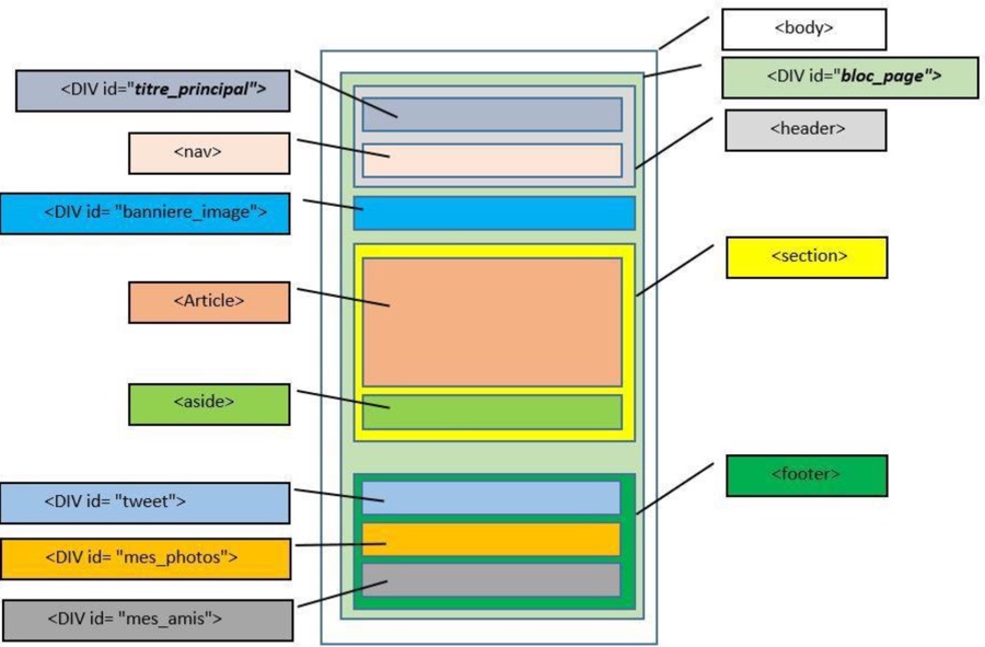
Créez `index.html` avec la structure suivante :
```html
Pastor - Grimoire de la cuisine
```
### F.3 Contenu HTML détaillé
**Header (`titre_principal` + `nav`)** :
- Image `pastor.png` (logo)
- Titre h1 : "Pastor"
- Titre h2 : "Grimoire de la cuisine"
- Menu de navigation : Accueil, Blog, CV, Contact (liens vers le site du lycée)
**Bannière (`banniere_image`)** :
- Texte : "Retour sur mes vacances en Asie... Voir l'article"
- Image de flèche `flecheblanchedroite.png`
- Lien de classe `bouton_rouge`
**Article** :
- Image `ico_epingle.png`
- Titre h1 : "Je suis un grand gourmand"
- 5 paragraphes de texte (lorem ipsum)
**Aside** :
- Titre h1 : "A propos de l'auteur"
- Image `bulle.png` (id="bulle")
- Image `pastor.png` (id="pastor")
- Paragraphe de présentation
- Icônes : `facebook.png`, `twitter.png`, `vimeo.png`, `flickr.png`, `rss.png`
**Footer** :
- `tweet` : Titre + 2 paragraphes (class="ragot")
- `mes_photos` : Titre + 4 images `photo_min_X.jpg`
- `mes_amis` : Titre + 2 listes (Perceval, Roi Arthur, Léodagan, Karadoc / Merlin, Lancelot, Bohort, Guenièvre)
### F.4 Styles CSS
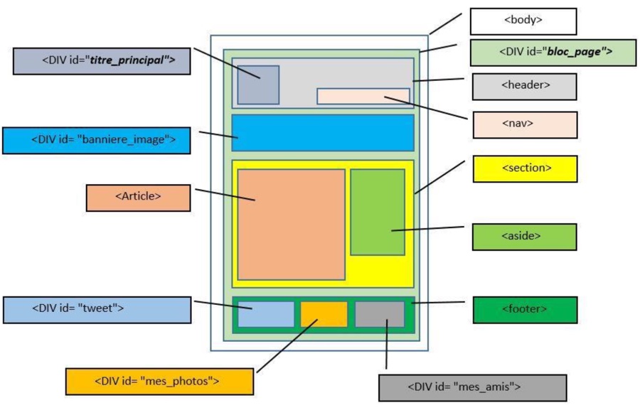
Voici le schéma de positionnement CSS du site :
Créez `style.css` avec les règles suivantes :
#### Styles généraux
```css
body {
background-image: url("../images/fond_jaune.png");
font-family: "Trebuchet MS", Arial, Helvetica, sans-serif;
color: #333333;
}
#bloc_page {
width: 900px;
margin: 0 auto; /* Centrage horizontal */
}
h1 {
text-transform: uppercase;
}
```
#### Header
```css
header {
background: url("../images/separateur.png") repeat-x bottom;
}
#titre_principal h1 {
font-size: 5em;
font-family: Arial, cursive;
display: inline-block;
margin-bottom: 0;
}
#titre_principal h2 {
font-size: 1.1em;
font-family: Verdana, Geneva, sans-serif;
margin-top: 0;
}
nav {
display: inline-block;
width: 90%;
text-align: right;
}
nav ul {
list-style: none;
}
nav li {
display: inline-block;
margin-right: 15px;
}
nav a {
font-size: 1.3em;
color: #181818;
text-decoration: none;
padding-bottom: 3px;
}
nav a:hover {
color: #760000;
border-bottom: 3px solid #760000;
}
```
#### Bannière
```css
#banniere_image {
margin-top: 15px;
height: 200px;
border-radius: 5px;
background: url("../images/bangkok.jpg") no-repeat;
background-size: cover;
color: white;
font-size: 0.8em;
position: relative;
box-shadow: 0 14px 14px #1c1a19;
margin-bottom: 30px;
}
.bouton_rouge {
display: inline-block;
height: 20px;
position: absolute;
background-color: #993300;
font-size: 1.2em;
color: white;
text-align: center;
padding: 5px 10px;
text-decoration: none;
}
```
#### Section (article + aside)
```css
section {
display: flex;
gap: 20px;
}
article {
flex: 2; /* Prend 2/3 de l'espace */
text-align: justify;
}
article p {
font-size: 0.8em;
}
aside {
flex: 1; /* Prend 1/3 de l'espace */
background-color: #706b64;
border-radius: 5px;
padding: 10px;
color: white;
font-size: 0.9em;
box-shadow: 4px 4px 5px #1c1a19;
}
#bulle {
position: absolute;
top: 100px;
left: -12px;
}
```
#### Footer
```css
footer {
margin-top: 10px;
padding: 30px;
background: url("../images/separateur.png") no-repeat top;
display: flex;
}
#tweet {
width: 25%;
}
#mes_photos {
width: 40%;
}
#mes_amis {
width: 25%;
}
#mes_photos img {
border: 1px solid #181818;
margin-right: 2px;
}
.ragot {
font-style: italic;
}
footer h1 {
font-size: 1.1em;
}
footer p, footer ul {
font-size: 0.8em;
}
.amis {
color: #760000;
text-decoration: none;
}
```
### F.5 Rendu attendu
Votre page doit ressembler à ceci :

---
## Résumé des propriétés CSS
### Texte
| Propriété | Valeurs courantes |
|-----------|-------------------|
| `color` | `#333`, `red`, `rgb(0,0,0)` |
| `font-size` | `16px`, `1.2em`, `1rem` |
| `font-family` | `Arial, sans-serif` |
| `font-weight` | `normal`, `bold`, `700` |
| `text-align` | `left`, `center`, `right`, `justify` |
| `text-decoration` | `none`, `underline` |
| `text-transform` | `uppercase`, `lowercase`, `capitalize` |
### Boîte
| Propriété | Valeurs courantes |
|-----------|-------------------|
| `width`, `height` | `300px`, `50%`, `auto` |
| `margin` | `10px`, `10px 20px`, `auto` |
| `padding` | `10px`, `10px 20px 10px 20px` |
| `border` | `1px solid black` |
| `border-radius` | `5px`, `50%` |
| `box-shadow` | `4px 4px 5px #999` |
### Arrière-plan
| Propriété | Valeurs courantes |
|-----------|-------------------|
| `background-color` | `#fff`, `transparent` |
| `background-image` | `url("image.png")` |
| `background-size` | `cover`, `contain`, `100px` |
| `background-position` | `center`, `top left` |
| `background-repeat` | `no-repeat`, `repeat-x` |
### Flexbox
| Propriété | Valeurs courantes |
|-----------|-------------------|
| `display` | `flex` |
| `flex-direction` | `row`, `column` |
| `justify-content` | `center`, `space-between` |
| `align-items` | `center`, `flex-start` |
| `gap` | `20px` |
| `flex` | `1`, `2` |
---
## Ressources
- **CSS Diner** : [flukeout.github.io](https://flukeout.github.io) - Sélecteurs CSS
- **Flexbox Froggy** : [flexboxfroggy.com](https://flexboxfroggy.com) - Flexbox
- **MDN CSS** : [developer.mozilla.org/fr/docs/Web/CSS](https://developer.mozilla.org/fr/docs/Web/CSS)
- **Can I Use** : [caniuse.com](https://caniuse.com) - Compatibilité navigateurs
---
## Licence
**Auteur** : Florian Mathieu
**Licence** : [CC BY-NC-SA 4.0](http://creativecommons.org/licenses/by-nc-sa/4.0/)
[](http://creativecommons.org/licenses/by-nc-sa/4.0/)
Ce document est mis à disposition selon les termes de la Licence Creative Commons Attribution - Pas d'Utilisation Commerciale - Partage dans les Mêmes Conditions 4.0 International.